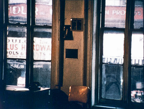
The subject sits in front of the interviewer and tells her sad story. The subject sits in front of the interviewer, over whose shoulder is aimed a camera, and tells her sad story. The subject sits in front of the interviewer, over whose shoulder is aimed a camera, behind which crouches a man squinting into a viewfinder, and tells her sad story. She hesitates when asked to say a little something about how it must feel to have gone through such an ordeal. It's still so hard to talk about. The man with the squinting eye reaches in two directions at once: one hand down between his legs, the other to curve around the zoom lens, trained on the subject, aimed from the outset of the interview so that a simple zoom will shrink the frame around her eyes in order to squeeze out a tear or preferably two.
And it starts. Her response to the difficult question. The rising action. His heart races. Her chin puckers. His fingers tug the tiny shaft. Her eyes look left and right. She tells her sad story. He moves in closer, close enough to feed upon the tears of wounded subjects. The interviewer tilts her head to the right and nods to keep the subject talking, and then shifts her notepad to the opposite knee so that, when the time comes, she can reach forward and pat the subject's hand, a comforting attagirl for a job well-done. It's a crucial moment. But the squinting man is in charge. His choice to begin zooming now, to draw the viewer into the miserable world of the subject, will govern the edit, will define the scene. When he stops zooming, the scene is over, but not before. It's his shot to get, and his to lose. He stands astride the very earth.
* * *
Elvis Costello's song "Satellite" goes like this:
She looked like she learned to dance

From a series of still pictures

She's madly excited now

She throws her hands up like a tulip
She looks like an illustration
Of a cocktail party
Where cartoon bubbles burst in the air,Â
Champagne rolls off her tongue
Like a second language
And it should have been her biggest night

The satellite looks down on her as she begins to cry
All over the world at the very same time

People sharing the same sorrow

As the satellite looks down

Her darkest hour is somebody's bright tomorrow
He pulled on a cigarette

In the crook of his first finger

Felt the static electric charge

Of her perfect hourglass figure
As he undressed her with his eyes

Her weakness was his talent

How could she know as she stepped through the lights

That her dress would become transparent?
And with his face pressed to the screen,Â
He muttered words he'd never dare to say
If she could see him
All over the world

At the very same time
...
The satellite looks down

Right now and forever

What it has pulled apart

Let no man tether
Lenses with a variable focal-length, aka zoom lenses, were invented in the early days of cinema, but they weren't in wide use until the 50's. Suddenly practical, a zoom lens enabled a camera operator to appear to move closer to the subject without actually traveling. It's a trick of optics, of course. The zoom lens can't change the operator's point of view, can't enable the camera to see around objects. But it's a lot more convenient than laying tracks and setting up a dolly, which would allow the camera to roll around.
The difference between the zoomed-out shot and the zoomed-in shot, when everything else is the same, is essentially two operations in one: a crop and an enlargement. Every lens has a focal length which defines how much cropping and enlarging it applies; a zoom lens has a lever that allows you to adjust the focal length at will or even do it gradually while filming, which creates an effect similar to movement.
But the human brain can tell the difference between a zoom and a dolly shot, the same way that it can separate near objects from far objects, the same way that a tilt of the head can render a slightly different view and peel apart the spatial layers between your nose and the horizon. You can cover the moon with your thumb, but you cannot cover a movie screen with your thumb, unless you bring your thumb very close to your eye. The brain can do the math; the brain knows that thumbs don't swell so dramatically.
Use of zoom lenses has often been frowned upon by purists, both aestheticians who want the viewer to understand the space of a film and documentarians who are acutely aware of the camera's inherent biases. Documentarian Jean Rouch, whose goal was always to "take the camera among mankind," argued against the use of zoom lenses -- and even tripods -- for documenting societies and cultures, because they implied an intimacy that the filmmaker may not have achieved and were condescending to subjects. He felt the ideal of Dziga Vertov's "cine-eye" was a camera that could be carried.
Cinematographer Richard Leacock has written about his conversations with legendary filmmaker Robert Flaherty (Nanook of the North) who felt that the purpose of a close-up isn't so much to reveal detail but to withhold information from the viewer, namely by eliminating everything outside of the tight shot. "The camera is like a horse with blinders," he said.
And in that sense, a zoom is similar in function to Griffith's irises.
The zoom effect has no counterpart in the natural world -- if you run down a path, you're simulating a dolly, not a zoom -- so it lends a modern sensibility to whatever it's used against.
In the documentary Stanley Kubrick: A Life in Pictures, Martin Scorsese admits his surprise at seeing Stanley Kubrick use zoom lenses in Barry Lyndon. Kubrick had created a lush period piece, a costume drama in which seemingly no detail was spared his scrutiny. He'd commissioned special lenses so that he could light his indoor scenes with real candlelight, but for his outdoor scenes, he scanned the vast garden by panning with telephoto lenses. If he was going for a historical look, why shoot it with such modern optical effects? And why dress such elaborate sets and explore them from a tripod?
"The use of the zoom lens is very interesting because you would never do-- who would think of using a zoom lens in the past? Never! No, the zoom lens flattens it out," says Scorsese, "like an 18th century painting."
So our eye does have a natural, pre-cinema counterpart to the zoom, after all: looking at paintings. No matter where you stand in relation to a painting, the artist's perspective remains fixed in two dimensions. Moving across the floor to look at a painting from different distances resembles the pan and zoom operation of a camera.
A year before Kubrick finished Barry Lyndon, Peter Watkins' masterpiece Edvard Munch appeared on European television and used documentary techniques -- reaction interviews, droll narration, cinéma vérité camera work with zoom lenses -- to tell the story of the famous Norwegian painter. Munch sits quietly in each scene and glances uncomfortably at the camera that nosily follows him around. It's anachronistic, of course, but it feels surprisingly natural, in part because of a modern viewer's familiarity with documentary techniques, I suppose, but also because our visual experience with pre-cinematic eras comes to us entirely through fixed perspectives, the same kind of flattened spaces that cinema produces with zoom lenses.
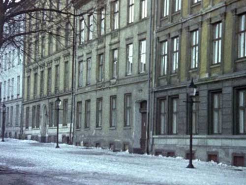
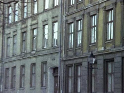
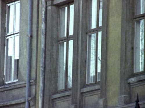
A good Top Ten list has a very clear domain and crisply ticks off its ten items without dawdling. It's not a scrapbook of song lyrics, movie stills, video clips, post-it notes, and ruminations from left-field. It zooms smoothly from beginning to end, and when Number One is reached, the entire operation has a certain finality and confers upon the reader a sense of satisfaction with the choice, and perhaps even a twinge of sadness that the experience is complete. Also, a good Top Ten counts down to one, not up to ten, and especially not up to sixteen. Cripes!
Can a zoom lens simulate motion? No, we've already established that. It's an optical trick. It crops and enlarges.
And yet look at the first few minutes of Abderrehmane Sissako's Life on Earth which features a jump cut reminiscent of Kubrick's famous cut in 2001: A Space Odyssey that spans all of human existence. Sissako's only spans 2,300 miles, but in a Top Ten list of jump cuts, I'd include them both.
A man, played by Sissako himself, is shopping in a French supermarket. The camera glides across aisles, shelves, and packages of food to create a wordless but vaguely bemused and even melancholy view of French culture as seen by an outsider. The scene ends when the man steps onto an escalator. The camera looks down at him, and he looks up as he climbs. After a few seconds, we get a shot of the underside of a tree. It's a tree in Mali, we come to find, but Sissako shoots it as if it's the reverse of the escalator shot, the point-of-view of the man holding the handrail. Sissako zooms up toward the tree at roughly the same speed as the escalator, so in this context, it looks like the continuation of a movement that began in the supermarket, and maybe it's the continuation of a mental state as well. Was the man comparing the sights and sounds of the market to his home in Mali?
So, no, zooms cannot simulate movement, except when they do. Because, of course, if the subject is distant enough, a zoom would be virtually indistinguishable from a dolly. Although, if the subject is very, very far away, a dolly probably wouldn't be capable of moving toward it with perceptible speed. A shot taken from earth that seems to move toward the moon -- that is, a shot in which the moon appears to grow within the frame -- must be a zoom, not a dolly, even though the perspective, the moon against the night sky, is practically the same in both cases. A dolly would need tracks aimed at the moon, and enough of them to glide close enough that it gets big.
Unlikely, man. Freaking expensive!
To shoot his tree, Sissako could have built a little ramp with the same incline as the escalator and run his camera up toward the tree. Maybe he did. But I bet he just set it down low, angled it up, and timed his zoom carefully. The magic is in the cut, a variant of the Kuleshov effect. The zoom is beautifully economical.
Simulating movement with a zoom is loathsome except when it's laudable, and so this Top Ten list has turned to jelly.
And of course a zoom simulates nothing in the natural world except possibly a lens that's in the story. Many a rooftop surveillance camera or telescope has been rendered subjectively through zoom lenses. Think of Francis Coppola's The Conversation, a film neatly sandwiched between his two Godfathers, shot in San Francisco, sometimes from rooftops overlooking Union Square.
And even when there isn't literal surveillance going on, like in the opening of Super Fly, the zoom from overhead gives us the impression that the man on the sidewalk below is being watched -- by the cops, by rivals, by God -- and needs to look out.
What's Bela Tarr doing in Satantango when a man with binoculars is peering out his window? He's letting us look through the binoculars. We don't see the zoom action itself, only the same fixed focal length that binoculars would provide, so Tarr may have been using a freaky lens. Chances are, though, he used a zoom and ran it all the way in. Economy, again. You can't argue against it.
OK, but what was Kubrick doing with those quick zooms in Full Metal Jacket and Eyes Wide Shut, the former aimed at a sniper firing onto Matthew Modine and his men, the latter at a masked woman firing blank looks at Tom Cruise. In each case, the zoom conjures the feeling of sudden panic in the face of an overhead attack -- a beam is falling, rocks are raining down -- and it does it with the crude style of spun dials.
And yet it's dangerously close to the accepted manner of shooting go-go dancers in cages.
I could have made two Top Ten lists. Loathsome in one, laudable in the other. But now I'm not sure what goes where. The loathsome list would have begun with such force: that damn tear-jerking scheme of television interviews and bad documentaries. And then it would continue to detail the use of zooms to fake movement, presenting a portrait of the lazy filmmaker sitting behind a tripod vs. the bold groundbreakers walking among their subjects.
But now, so many exceptions, so much flattening of the picture on purpose, so much adoption of the zoom only because we're familiar with it, like writers using dialect. Ain't fair.
A good Top Ten should be decisive. It should narrow the field and imply breadth. "Here's all you need to know about Piss Widgets, in ten digestible bites." It should crop and enlarge.
In his essay entitled "The Cognitive Style of Powerpoint," in a section called "The Hierarchical Bullet List Dilutes Thought," general purist and hardcore high-resolutionist Edward Tufte writes:
It is unwise and arrogant to replace the sentence as the basic unit for explaining something. Especially as the byproduct of some marketing presentation software. For the naive, bullet lists may create the appearance of hard-headed organized thought. But in the reality of day-to-day practice, the [Powerpoint] cognitive style is faux-analytical, with a bias towards promoting effects without causes.
But this isn't a mere bullet list. It's numbered. Thus, Mr. Tufte has been cowed.
Plus, an interleaved list is not without precedent in the literature. David Letterman's Top Ten lists were originally conceived back in the 80's (when Merrill Markoe led the writing team) at the dawn of People Magazine's -iest-alive lists. Sexiest Man Alive and such. The magazine kicked off the institution in 1985 with Mel Gibson topping the chart. Pioneers, those people at People were. Look around you today. This is the house that People built.
Letterman's People parodies, so to speak, weren't broadcast nightly as they are now, just occasionally. And they weren't jokes about the day's news but a deceptively simple structure around absurdity and non sequiturs. Here's an actual example of a Letterman Top Ten, broadcast on April 29, 1986:
Top Ten Cartoon Characters or Organized Crime Figures
10. Felix the Cat
9. Popeye the Sailor
8. Jimmy the Weasel
7. Matty the Horse
6. Rocky the Flying Squirrel
5. Dominic the After Dinner Mint
4. Scooby-Doo the Butcher
3. Grant the Chairman
2. Vito the Cartoon Chipmunk
1. Huey, Dewey, and Louie, Gli Anatroccoli Della Morte, the Ducklings of Death
Grant Tinker was the chairman of NBC, you'll recall, and the butt of many a Late Night joke. Another example, this one from February, 1987:
Top Ten Things Characteristic of Ted Koppel or Insects
10. Can eat through fabric.Â
 9. Can feel superior to Sylvester Stallone.Â
 8. Can carry gigantic crackers back to nest or dressing room.Â
 7. Enjoy chats with Sam Donaldson about big melting Hershey bar on sidewalk.Â
 6. Builds home out of own body secretions.Â
 5. Can annoy Barbara Mandrell in her sleep.Â
 4. Really enjoy Art Buchwald's jokes. (insects only)Â
 3. Have ruined many a young boy's camping experience.Â
 2. Sticky hair on legs useful in organizing evening's notes.Â
 1. Can breed in standing water.Â
I submit these vintage Top Tens (which I remembered fondly and recovered from the memory hole) as supporting documents for the interleaved approach. Indeed, in Late Night's early days, the surreal humor of the Top Ten seemed to spring from the "or" in each list's title. With the announcement of every numbered item, the viewer's brain went zooming in two directions at once, to either side of the "or."
Is there a cinematic equivalent?
If a zoom simulates movement with no change in perspective and a dolly captures actual movement, what might happen if you set them against each other in an arena of the absurd? Ask Alfred Hitchcock:
Alfred Hitchcock [talking to Francois Truffaut about Vertigo]: Did you notice the distortion when [Jimmy] Stewart looks down the tower stairway? Do you know how we did that?
Francois Truffaut: Wasn't that a track-out combined with a forward zoom?
AH: That's it. When Joan Fontaine fainted at the inquest in Rebecca, I wanted to show how she felt that everything was moving far away from her before she toppled over. I always remember one night at the Chelsea Arts Ball at Albert Hall in London when I got terribly drunk and I had the sensation that everything was going far away from me. I tried to get that into Rebecca but they couldn't do it. The viewpoint must be fixed, you see, while the perspective is changed as it stretches lengthwise. I thought about the problem for fifteen years. By the time we got to Vertigo, we solve it by using the dolly and zoom simultaneously. I asked how much it would cost, and they told me it would cost fifty thousand dollars. When I asked why, they said, "Because to put the camera at the top of the stairs we have to have a big apparatus to lift it, counterweight it, and hold it up in space."
I said, "There are no characters in this scene; it's simply a viewpoint. Why can't we make a miniature of the stairway and lay it on its side then take our shot by pulling away from it? We can use a tracking shot and a zoom flat on the ground." So that's the way we did it, and it only cost us nineteen thousand dollars.
Here's the result:
It's a terribly clever idea and a classic effect. The camera moves forward but the lens zooms back, or vice-versa. The operations cancel each other out, but since they work very differently, the canceling is not exact, and the result is disorienting.
But you'll notice in the slow motion video that the camera in Vertigo actually tracks forward and is counteracted by a zoom-out. Either Truffaut had it backward, or the footage is reversed in the film. Here's how to tell: in the second slow motion example, look at the far right edge of the frame. A beam obscures the window, but as the scene progresses it obscures less and less, meaning the camera must be moving forward past the beam.
Like all good special effects, Hitchcock's idea (which some sources say he worked out in collaboration with a second unit cameraman named Irmin Roberts) is perfectly simple. It's called a "dolly zoom," for obvious reasons, or sometimes a "trombone shot," for reasons that only musicians could understand. But after Spielberg used the effect in Jaws to convey Roy Scheider's panic on the beach, its popularity soared, and, according to Richard Rickitt's history of special effects, it's become a cliché that seems to pop up everywhere.
So here we finally have a loathsome entry: the overuse of the sublime. Mathieu Kassovitz made a particularly bombastic show of the dolly zoom in La Haine, where the effect is so extreme that one wonders if rear projection was used instead, even though the jerkiness of the shot implies that the camera is traveling, unless that's fake, too.
Even though it's no longer rare or clever, judicious use of the dolly zoom still works an otherworldly magic. Take for example its several subtle appearances in the HBO series The Wire. In his conversation with Truffaut, Hitchcock talked only about Vertigo's tower scene, which includes two quick shots of panic, but those shots actually recall another moment early in the film when Scotty (Stewart) is dangling from a rooftop. So the latter use of the dolly zoom not only gives us another taste of Scotty's vertigo but also uses the visual rhyme to give us a clue of what's going through Scotty's head. He's worried, man. He's been in this situation before.
Note in the shots of the tower that Scotty's hands and shoes are visible there; presumably they were a part of the model, since they stretch along with the tower. — RD
In the second season of The Wire a man and his nephew are having a conversation next to a chain link fence, and the dolly zoom is used to separate them from the city in the background, lift them into a hover, but leave them trapped behind chain link. The unusually glossy moment also sets this scene apart from the rest of the episode and marks it as important. (In the clip below, note how the horizontal post in the upper left corner remains fixed even as the city seems to recede; in a low angle shot, the camera moves forward and pans upward.)
In a later episode, we see just the younger man in a similar locale, but since this brief scene is given the same treatment, it's linked with the earlier conversation. And notice that near the end of the shot, the dolly is allowed to outpace the zoom, which slides the shot into a close-up.
Like Hitchcock's original use, the shots in The Wire accomplish several bits of character development and don't seem intended to dazzle us with technique.
And finally, for contrast, another moment in The Wire when the camera tells us that a chance meeting in the hallway is important, not with tricks or effects, but with simple, distinctive movement: two dollies move in opposite directions -- without zooming -- to construct a pair of reverse shots, like Sissako's escalator.
Spoilers: if you have not watched the second season of The Wire and intend to, avoid the clips below, even though they have no sound.
Of course sporting events and concerts are often shot with zoom lenses so that cameras can be stationed at the periphery but still record the action on the field or stage in enough detail that it's visible on tiny home screens.
Since we all know that such events are shot this way, might artists use this fact against us? Yes, Robert Altman might shoot Nashville this way and give the impression that he's observing real events, that he's capturing a concert in the park, that he's watching celebrities deplane just like the unwashed masses who have their noses pressed to the airport's glass. Maybe he practiced this technique while shooting a football game in M*A*S*H, maybe the technique meshes well with an ensemble of improvisors. Might filmmakers riff on the idea of the zoom, might Douglas Gordon and Philippe Parreno assemble a portrait of soccer player Zinedine Zidane using a large number of close-ups, so we see ankles and grass but not much game play? And might the Zidane film resemble the recent work of the inimitable Claire Denis, who's been shooting ballerinas and Sonic Youth in extreme close-up, zoomed in so far that the performances become abstract?
Might the practitioners of cinéma-vérité use quick, sloppy zooms to simulate the footage that normally ends up on the cutting room floor, the footage shot by a cameraman scrambling to get the shot when events are happening faster than he expected? The simulation implies that what we're watching is not only sudden and surprising but also important -- the operator felt it was so important that he cranked the zoom quickly to reframe the action, and the editor felt it was so important that even this sloppy zoom was left in the final film because it's the best shot they had of this event. And they had to include it. See: The Office or Baghead.
And might digitally rendered universes like the ones inside the computers at Pixar make use of the same effect? Might the virtual cameraman track along WALL*E's path in a medium shot but then pause to watch an old video screen showing Fred Willard for a few minutes. And when the recorded speech ends, might the virtual cameraman do a quick zoom to catch up with WALL*E who, having seen these videos for 700 years, did not stop when the camera did and rolled so far away that the operator must now quickly reframe the little bot in the far distance?
Yes. Sneaky bastards, the lot of them, using zooms as if they're a part of our visual grammar.

Michael Snow's experimental short Wavelength has a spine made of one very, very slow zoom. It takes some 45 minutes for the frame, which begins in a loft apartment, to home in on a picture of a wave that's pasted to the far wall. You could set up a machine to do just such a slow zoom, to nudge the lever at the appropriate rate, but the changes in and around the apartment make it clear that Snow didn't shoot the film this way. Through the window we see that day turns to night, for example, which implies that more than 45 minutes were filmed, but the occasional appearance of people entering the apartment -- and moving at a normal rate -- rules out time-lapse photography. So the concept of Wavelength is built around the very simple idea of a zoom and the idea of time-lapse photography, even though those two techniques are at odds technically and the effect must be achieved through a variety of means and several edits. What looks simple isn't.
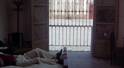
But, if anyone tells you that Antonioni used a slow zoom at the end of The Passenger, you have my permission to punch that asshole in the neck. It's a dolly. The perspective changes so that you can see a man reflected in the right-side glass door and, of course, so that the camera can leave the room through the window and then turn around to look back at Jack Nicholson. Try that with a zoom.
But I understand the confusion, because Antonioni seems to be using the grammar of the zoom lens without actually zooming. The camera crawls across the scene and moves in close to objects just like the telescopes on rooftops or the peripheral cameras at sporting events. It runs along like a one-man operation with a tripod and a fancy lens, except that it masterfully exceeds the zoom's capabilities. Filmmakers don't often do this sort of thing, because it's just plain hard to do.
Here's David Bordwell:
You might even argue that the pan-and-zoom style gets a kind of meta-treatment in the climactic shot of The Passenger. There in a grandiose technical gesture Antonioni’s concern for architecture, his refusal to underscore a melodramatic plot twist, and his love of camera movement blend with the technology of the zoom. At the time, several of us (maybe Jonathan too) saw this shot as a response to Michael Snow’s Wavelength, relayed through the sensibility of Passenger screenwriter and avant-garde filmmaker Peter Wollen. Now it looks to me like a natural response of a very self-conscious artist to a stylistic trend of the moment.
Nicholson reveals one of the shot's secrets in his warm and whispering DVD commentary. Bordwell is right; architecture was always a part of Antonioni's canvas.
It is likely that when the reader has reached the end of an interleaved Top Ten list such as this, she will land precisely where she started, the apparent distance from the subject having remained unchanged but everything in view having been thickened like leavened bread.


Rob, here's one more for your list: Rossellini.
I'll excerpt from Chris Fujiwara's piece on Rossellini and the zoom in Hermenaut:
"Certain filmmakers have from time to time revived zoom's radical potential. Roberto Rossellini, who pioneered the neorealist movement in the '40s and continued making films that documented postwar malaise with an ethnographer's (and a philosopher's) eye, was one of the first major directors to embrace the zoom. The series of historical films he made from 1964 to 1976 shows the full flowering of his zoom aesthetic. In these magnificent films—whose general unavailability should be a scandal—Rossellini gets audiences interested in long discussions (adapted from historical texts) about man, God, art, and science. With simple sets and costumes and a few extras, and with amateur actors who are kept from imitating movie acting, each film creates an exact visual and behavioral idea of its period—the Athens of Socrates, Florence of the Medici, the world of Saint Paul—getting the viewer to share Rossellini's amazement at the things people did, and ultimately to understand their beliefs and prejudices. As we witness characters making choices, affecting and being affected by their worlds, we understand, as we do in only a few movies, and rarely enough in life, what it means to live in freedom.
"Rossellini's zooms create a new kind of cinematic rhythm: an optical rhythm. In Augustine of Hippo (1973), the zoom is in tempo with the actors' movements. The camera slowly zooms in, then out on a scene in a 4th-century hair salon. When a dark-robed man strides into the shot and sits in the background, the zoom becomes quicker, more determined, matching the quality of the entrant's movement, and then stops momentarily, as if to give the eye of the viewer time to adjust to this new element of the scene."
He also mentions Tarkovsky, "a director who thought of cinematic form and his own artistic responsibility in the most rigorous way conceivable, and who would have ridiculed the idea of talking about his films in terms of a particular technique. Yet it can do no harm to notice that Tarkovsky's films present a completely original and personal aesthetic of the zoom lens. Tarkovsky's zoom is his consciousness. It's the vehicle for the freedom from the determinism of time that he reclaims in the name of identity, memory, history."
[...] good Top Ten list has . . .” Daily Plastic presents the “Top Ten Loathsome or Laudable Uses of a Zoom Lens,” a list that is brilliantly meta in a way that reminds me of John Barth’s “Lost [...]
Hello,
What a great link this is.
I have been trying to find out when the first zoom was used and in what movie?
Do you have that answer by any chance?
Look forward to hear from you.
Kind regards,
Ruurd M. Fenenga
The cut from the bone to the satellite in "2001: A Space Odyssey" is a match cut, not a jump cut.
Good point. You're right.